


TELEPRESENT ROBOT
APPLE VISION PRO
Apple vision pro combined with telepresence robot, users can remotely watch the exhibition and get a virtual reality immersive experience, interact with the artworks and participate in the virtual tour, online choose the exhibition route they are interested in, collect the artworks they are interested in, and get to know the story behind the artworks in depth, the combination of the two realises high quality of watching the exhibition anytime and anywhere.


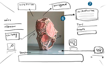
BACKGROUND
With rapid advances in digital and immersive technologies, people increasingly expect remote experiences to be interactive, personalized, and spatially rich. Telepresence robots—mobile platforms equipped with audiovisual systems and remote controls—enable users to navigate real-world environments from a distance, offering a stronger sense of presence and agency than traditional video conferencing (Kristoffersson et al., 2013).
This shift aligns with broader trends in spatial computing, seen in devices like Apple Vision Pro, which promote hybrid interaction across physical and digital spaces (Apple Inc., 2023). Cultural institutions, especially museums, are exploring such technologies to expand accessibility and engagement.
Compared to static virtual tours, telepresence robots allow remote visitors to explore exhibitions freely, access real-time information, and interact with guides, creating deeper and more participatory experiences (Damala & Cubaud, 2008).
Although the pandemic accelerated demand for remote tools, this evolution reflects long-term shifts in how people connect, learn, and experience culture (Dey et al., 2021).
This project proposes a conceptual interface design for museum-based telepresence robots, aiming to support intuitive, immersive interactions that allow global audiences to engage with cultural spaces regardless of location.


ETHNOGRAPHY


Art Professioals
Art professionals seek a high-quality and thoughtfully curated exhibition that showcases their expertise and helps amplify the visibility of their work. They care deeply about content, layout, and design, and are often looking for platforms to extend their artistic influence.
-
Have strong personal opinions on art.
-
Pay close attention to exhibition presentation and design.
-
Aim to promote and share their artwork through exhibitions.
Art Neophytes
Art newcomers are interested but underexposed. They often lack knowledge, have limited access to expert resources, and rarely get opportunities to engage directly with artists. They desire approachable, engaging experiences that can help them learn more.
-
Curious about art but unsure where to start.
-
Limited art literacy and fewer educational resources.
-
Want more chances to interact with artists.
Bio
Caroline is an artist and has held many exhibitions. Due to her age, she cannot travel long distances, but she really wants to participate in exhibitions around the world. Caroline usually looks at the works of other artists and communicates with them to gain inspiration. She can use phone to translate when watching exhibitions, but the complex operation of phone can affect the viewing experience. She hopes to participate in the exhibition more conveniently........
Pain Points
· Due to time difference, and health reasons, may miss many exhibition invitations
· Unable to access the latest art news and current events
· Unable to effectively communicate with artists from various countries
· Understood that the art content in the museum is too superficial
Motivations
· Love for art and art exhibitions
· The satisfaction of receiving feedback when a work of art brings a certain meaning
· Hope that art can be disseminated and exchanged, and continuously passed on through exhibitions
Goals
· Watch different exhibitions without making choices
· Be able to communicate with more artists
· Capable of continuously producing artistic works

PERSONA

Caroline Morel / Artist
Age: 51
Gender: female
Location: Marseille,France
Major: master of graphic design
Aim: to communicate with more artists around the world

USER JOURNERY

HEURISTIC EVALUATION
After each iteration, I selected two groupmembers to evaluate my prototype. The first phase focused on the smoothness of the flow of the apple vision pro, the second phase focused on the clarity of the design of each interface, and the third phase focused on the functionality of the prototype. Each evaluator was evaluated twice, the first time after the evaluator was free to use the product and comment on it, and the second time during the evaluation, I observed whether the evaluator's clicks were in line with my expectations. Based on Nielsen's ten principles of usability(Nielsen, 2024), the following results were obtained:


Success Areas:
·The first phase:
The main flow of the interface is clearly presented and coherent as a completed forward flow.
· the second phase:
With a uniform colour palette and a layout similar to that of the apple ecosystem, users can quickly get up to speed with apple vision pro by becoming familiar with other Apple devices.
· the third phase:
The main flow is fully functional, allowing for a complete view of the entire flow.
Problem Areas:
· the first phase:
Firstly the lack of flow back and due to the inaccuracy of the mapping and the neglect of the telebot, the user asked me what kind of device this was to take her on a tour.
· the second phase:
As the vr interface is too large, the boundary of the interface function layout is wireless, resulting in some buttons scattered in the interface periphery leading to visual distraction
· the third phase:
The main flow of the exhibition could be designed to incorporate different interfaces for different exhibits such as sculptures, nft, interactive artefacts, etc.
LOW-FI ITERATION 1


The interface design is too finely segmented.
Setting up the best continuation of the interface as well as the habit of using the ipad categorization method.
Wireframs cannot place images.
According to Apple(2024), main control component is better to put in the side of the screen.
Important buttons are best placed around the perimeter of the screen for easy clicking.
Reducing the number of controls in the interface to improve the exhibition experience.
Notifications on the main screen can be a bit cluttered.


Less touch buttons and more language and eye gaze during exhibitions to increase the user experience
Need a button to go back or to another page.
Wireframs cannot place images.
LOW-FI ITERATION 2


The landing page should be changed to a robot-related interface.
Lack of "back" button
The preview screen should have buttons for direct action settings.
Directly entered the exhibition interface lacking the real scene of the remote robot walking in the museum

Go to viewing interface with gesture control


The tutor suggested in the fourth consultation that the design should be strengthened for the exhibition process.
Lack of "back" button
Lack of navigation bar to return to the main interface.
FINAL WIREFLOWS

Figma Apple Vision Pro Prototype
Back to Landing Page
Back to Pre-Visit Settings Page


Go to viewing interface with gesture control
According to apple's official UI design (tutorialApple Inc. n.d.), set up the navigation bar on the left and above.
In the pre-visit interface, you can directly enter the operation settings to change the layout and preview the interface again.
When the user rotates his head, the interface rotates with him (Hashemian & Riecke, 2017).
The exhibition route has been set up on the website.
Back to Exhibition Page


In the exhibition interface, there are function buttons for real-time translation, exhibit introduction, favourites and search.
When a user enters an immersive interface, the interface has no buttons and is controlled entirely by gestures and eyeballs (Li, 2024).
Back to Exhibition Page
Back to Last Exhibit Page


Back to Landing Page


PROTOTYPE
I have integrated the interface design of Apple Vision Pro into the entire Apple Vision Pro experience process.

REFLECTION

Designing for Apple Vision Pro marked my first transition from flat screen to spatial interface thinking. Beyond layout, I focused on how information is distributed and accessible within the user’s field of view. For example, I found that placing primary interaction modules within approximately 30 to 45 degrees in front of the user is most comfortable, as positions too high or too low cause neck strain. Interaction elements were positioned around half a meter away to facilitate natural hand gesture and eye-tracking selections. I also iteratively adjusted button sizes and spatial distances to minimize mis-taps during eye or gesture interactions.
Understanding Spatial Interface Design

I thoroughly studied visionOS design guidelines and existing Vision Pro applications, understanding the emphasis on spatial simplicity and immersion. To enhance the immersive experience, I used semi-transparent frosted glass backgrounds and soft lighting effects to highlight information hierarchy without overwhelming the surrounding environment. For multi-level menus, I adopted floating cards and depth transitions to guide users through the interface naturally.
Mastering Vision Pro’s Design Language

I applied Heuristic Evaluation during user testing to assess the interface from perspectives like visibility, consistency, and error tolerance. Testing revealed some icons were not intuitive, causing hesitation. I replaced them with more semantically clear visuals and added interaction feedback. Each round of evaluation drove continual refinement of the visual layout and interaction flow, ensuring usability across different user mental models.
Optimizing User Experience through Heuristic Evaluation

This project pushed me to place user experience at the heart of my design. I focused not only on the interface itself but also on the user’s feelings throughout the entire process—from entering the system, browsing content, to completing tasks. I created detailed user journey maps to identify pain points and improved the overall experience by adjusting interaction paths, streamlining task flows, and enhancing emotional resonance in the interface. This user-centered shift helped me integrate my role as both an interface designer and an experience designer.
User-Centered Experience Design Thinking

REFERENCES
Apple Inc. (n.d.). Design for spatial user interfaces - WWDC23 - Videos - Apple Developer. Apple Developer. https://developer.apple.com/videos/play/wwdc2023/10076/?time=165
Hashemian, A. M., & Riecke, B. E. (2017). Leaning-Based 360° Interfaces: Investigating Virtual Reality Navigation Interfaces with Leaning-Based-Translation and Full-Rotation. In Lecture notes in computer science (pp. 15–32). https://doi.org/10.1007/978-3-319-57987-0_2
Li, Z. (2024). Eyetracker based on image recognition technology and YOLOV8 implementation. drpress.org. https://doi.org/10.54097/wetfdb35